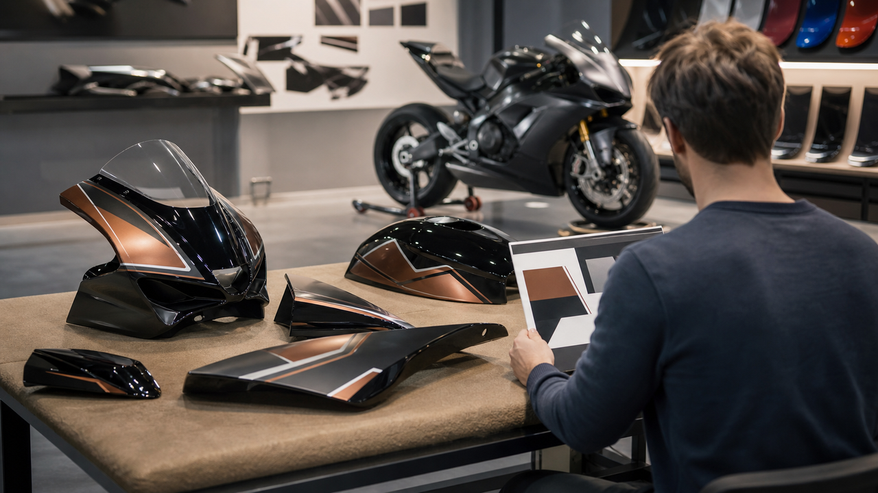

A custom fairing design looks cohesive when it feels connected to the motorcycle that is already there. The goal is not to decorate every available surface. It is to create a clear visual hierarchy that works with the bike’s shape, fixed components, and viewing angles.
The simplest approach is to choose one dominant color, one supporting tone, and one restrained accent. Repeat a small number of lines or shapes across the fairings, leave enough visual breathing room, and check the design from multiple angles before confirming it. This produces a motorcycle that looks intentional rather than visually crowded.
Start with the Motorcycle You Already Have
Before choosing fairing colors or graphics, take inventory of the parts that will remain visible. Wheels, fork tubes, the seat, frame sections, windscreen, exhaust, controls, and exposed hardware already create a visual palette. A successful fairing design responds to those elements instead of treating the bodywork as a separate canvas.
Photograph the motorcycle in neutral daylight from the left side, right side, front three-quarter, and rear three-quarter views. Then identify:
-
the largest existing color areas;
-
metallic, black, or neutral components that frame the bodywork;
-
small accent colors already present on wheels, suspension parts, stitching, or controls;
-
the strongest front-to-rear lines in the motorcycle’s silhouette;
-
components that should remain visually quiet rather than becoming another focal point.
This audit prevents a common mistake: selecting an attractive fairing design in isolation and discovering later that it competes with the rest of the motorcycle.
Build a Clear Color Hierarchy
Not every color should have equal visual weight. A strong design gives each color a job.
Choose One Dominant Color
The dominant color should define the motorcycle at first glance. It normally covers the largest uninterrupted fairing areas and creates continuity from the front cowl through the side panels to the tail. A dominant field also gives smaller graphics enough space to remain legible.
Add One Supporting Tone
The supporting tone should help shape the motorcycle rather than divide it into unrelated sections. It can follow a lower edge, frame a central panel, or connect the front and rear visually. Neutral tones are useful when the wheels, seat, and mechanical components already contribute significant contrast.
Use the Accent Color Sparingly
An accent is most effective when it appears in a few deliberate locations. It might highlight one directional stripe, a narrow border, or a small repeated shape. When the accent appears on every panel, it stops directing attention and becomes background noise.
Exact color matching is not always necessary. A coordinated contrast can look more intentional than two shades that are close but visibly different under daylight.
Follow the Bike’s Existing Lines
Motorcycle bodywork already contains creases, vents, openings, and changing surface angles. Graphics look more integrated when they follow or reinforce those features.
Use the main body line as a guide. A stripe that begins near the front should either resolve naturally at a panel edge or continue with a clear relationship on the next panel. Avoid placing an important detail where a seam, opening, or fastener will interrupt it.
Before confirming a layout, ask:
-
Does the design still read clearly when separate panels are assembled?
-
Do long lines continue naturally across panel boundaries?
-
Are the busiest graphics placed on surfaces large enough to support them?
-
Do vents and openings become part of the composition rather than accidental gaps?
-
Does the design strengthen the motorcycle’s forward motion instead of working against it?
Use Finish as Part of the Design
Color is only one part of visual coordination. Gloss, matte, and satin surfaces reflect light differently, so two areas with similar color can still feel unrelated if their finishes conflict.
Choose one primary finish for the fairings and use contrast only where it has a clear purpose. A mostly gloss design can use a small matte area to create depth. A mostly matte design can use a restrained gloss accent to catch light. Too many alternating finishes can make a simple palette feel unnecessarily complex.
When reviewing references, label the intended finish for each major area. Do not rely on color names alone; “black” can look dramatically different in gloss, satin, and matte treatments.
Repeat Visual Motifs Instead of Adding New Ones
Cohesion comes from repetition. Choose one or two recognizable motifs—such as a tapered line, geometric cut, or soft color fade—and repeat them with controlled variation.
Avoid giving every panel a unique graphic idea. If the front uses sharp angular shapes, the side uses sweeping curves, and the tail introduces an unrelated pattern, the motorcycle can lose its visual identity. Repeating a limited design language allows the eye to understand the whole bike quickly.
Negative space matters as much as graphics. Quiet color fields provide contrast, make the main motif easier to recognize, and prevent the design from looking busy at normal viewing distance.
Choose One of Three Cohesive Style Directions
Minimal and Architectural
Use a restrained palette, large clean color fields, and a small number of precise lines. This direction works well when the motorcycle already has visually strong wheels, exposed mechanical details, or distinctive lighting.
Technical and Directional
Use tapered shapes and front-to-rear lines that reinforce movement. Keep the shapes aligned with panel creases and openings. The design can feel energetic without becoming crowded if the accent color remains controlled.
Graphic but Balanced
Use one bold original illustration or repeated graphic motif as the focal point, then simplify the surrounding panels. The more complex the central artwork is, the quieter the remaining color fields should be.
Whichever direction you choose, avoid mixing all three. A clear visual identity is stronger than a collection of individually interesting ideas.
Review the Design from More Than One Angle
A side-view reference is useful, but it cannot show how a design behaves around the nose, tail, or curved transitions between panels. Review the concept from at least four views:
-
Side view: Check the overall color balance and front-to-rear flow.
-
Front three-quarter view: Confirm that the nose and side graphics feel connected.
-
Rear three-quarter view: Check how the design resolves around the tail.
-
Rider-height view: Look for areas that appear unbalanced from a normal standing or seated perspective.
Also review references at two sizes. A design may look refined when enlarged on a screen but become unreadable when viewed as a complete motorcycle. The main color blocks and motif should remain clear when the image is reduced.
Create a One-Page Style Brief
A concise style brief makes the final direction easier to communicate. It should include:
-
four clear photographs of the current motorcycle;
-
the dominant, supporting, and accent colors;
-
the primary surface finish;
-
one selected visual motif;
-
areas that should remain visually quiet;
-
original or authorized artwork files;
-
one preferred reference and one example of what to avoid.
The “avoid” example is especially useful. It can clarify that you do not want excessive graphics, too many colors, oversized text, or abrupt transitions—even when those points are difficult to describe with color references alone.
How Amotopart Supports a Cohesive Custom Direction
Riders can begin by selecting a compatible design from the Amotopart fairings collection and then use the chosen kit as the foundation for a style brief.
Amotopart’s current customization FAQ says riders can submit reference photos, sketches or mood boards, color names or RGB values, artwork files, and font preferences after ordering. Standard color, pattern, graphic, and design adjustments may be available without an additional charge, while unusually complex requests may affect cost or timing.
Use those options to simplify and coordinate the motorcycle rather than to fill every available panel. Confirm the selected palette, finish, and visual motif in writing, and review the completed-fairing photos before approving shipment.
Final Style-Matching Checklist
-
Identify the visible colors and finishes already on the motorcycle.
-
Choose one dominant color, one supporting tone, and one accent.
-
Follow existing body lines, seams, openings, and panel proportions.
-
Use one primary finish and limit contrasting finishes.
-
Repeat one or two motifs rather than adding a new idea to every panel.
-
Leave enough negative space for the focal design to stand out.
-
Review the concept from the side, front, rear, and rider-height views.
-
Provide original or authorized artwork in a clear, one-page brief.
-
Confirm any cost or timeline impact before production begins.
-
Compare completed-fairing photos with the approved style brief before shipment.
Frequently Asked Questions
How many colors should a custom fairing design use?
There is no universal number, but a dominant color, one supporting tone, and one restrained accent provide a useful starting structure. Additional colors should have a clear role rather than equal visual weight.
Do the fairings need to match the wheels exactly?
No. A deliberate contrast can look more cohesive than an almost-matching shade. If exact matching is important, provide clear daylight references and discuss how the chosen finish may change the way the color appears.
Should every fairing panel include a graphic?
No. Quiet panels create balance and make the main motif easier to recognize. Concentrate detail where the bodywork provides enough space and where seams or openings will not interrupt it.
What is the easiest way to avoid an overdesigned result?
Limit the palette, select one visual motif, and remove any element that does not strengthen the overall direction. Review the complete motorcycle at a smaller image size; if the focal idea is unclear, simplify the design.
What should I send with a customization request?
Send the order number, motorcycle photos, color references, finish preferences, a simple mood board, and any original or authorized artwork. Include one sentence describing the intended visual direction and a short list of elements to avoid.
Conclusion
Matching custom fairings to a motorcycle is an exercise in editing. The strongest designs do not use every color, finish, and graphic available. They select a small number of visual ideas and repeat them consistently across the bike.
Start with the motorcycle’s existing components, build a clear color hierarchy, follow the body lines, and review the concept from multiple angles. When the design still looks intentional after unnecessary details are removed, it is ready to become a clear customization brief.